
Appearance
Adding Charts
Detailed Steps to Add a Chart
Open the Visualization Pane
Click on the canvas in the editing page. On the right-hand side, locate the "Components" panel, where various chart icons are displayed.
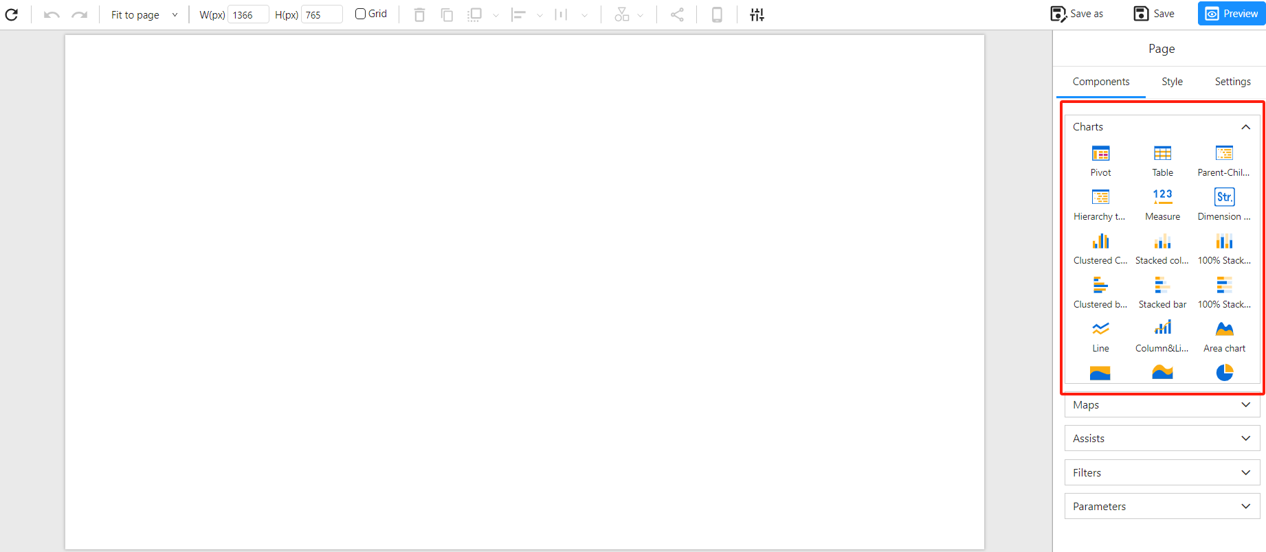
Select and Add a Chart
Choose the appropriate chart type based on your data visualization needs (e.g., bar chart, line chart, pie chart, scatter plot, etc.).
Click on the desired chart icon, then click on the report canvas or drag and drop it to create a blank chart placeholder.
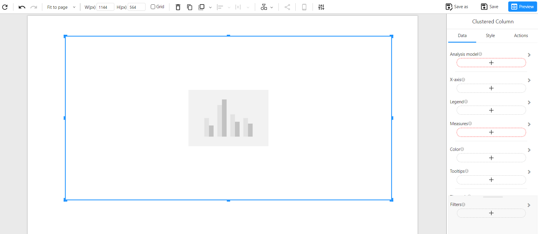
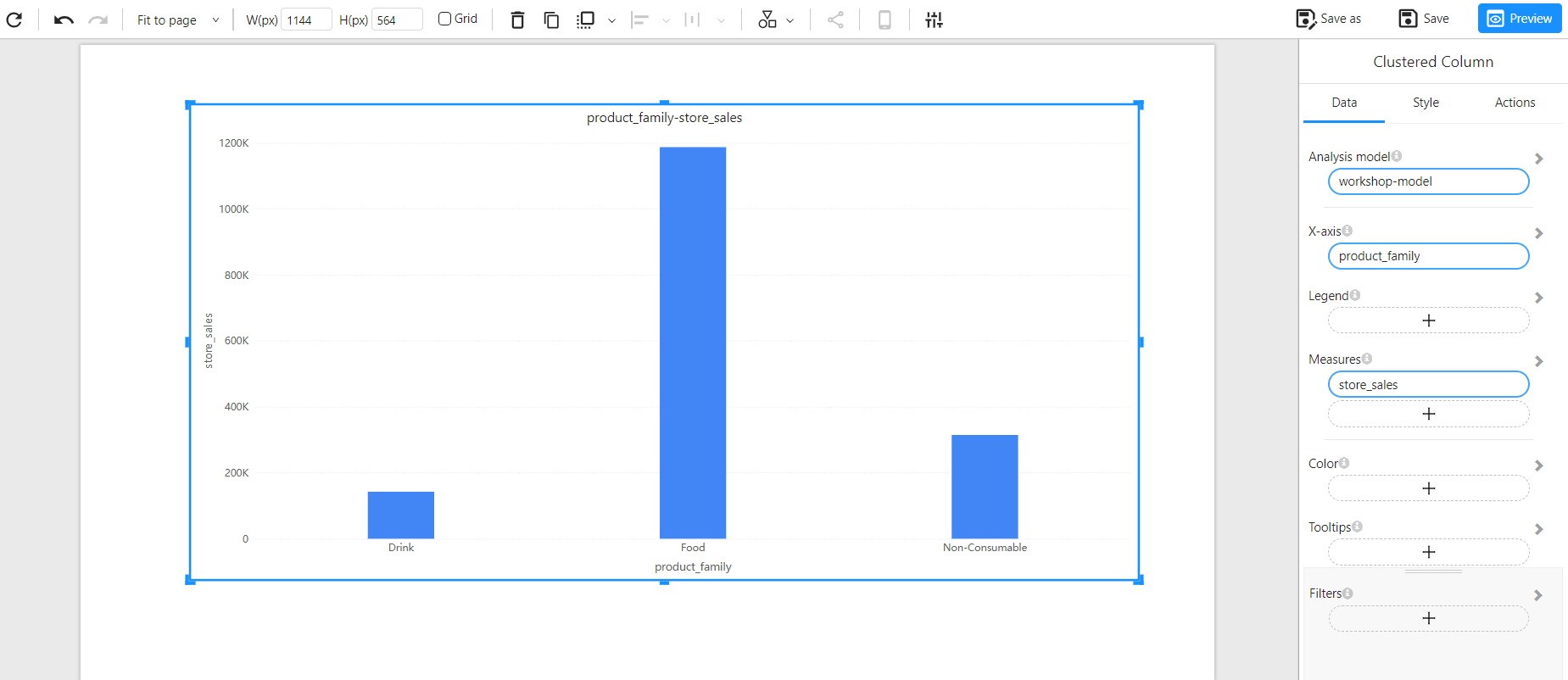
Configure Chart Fields
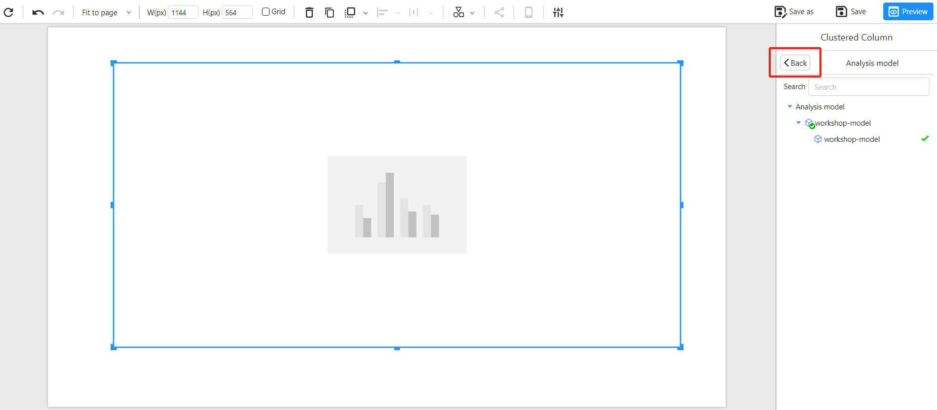
Click on the "Data" panel on the right and select "Analysis Model" to link an analytical model to the chart.
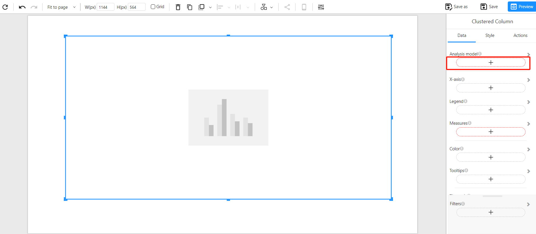
Select the desired analysis model.
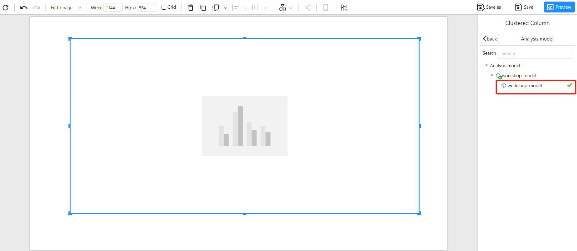
Click the "Back" button to return to the data panel.
Add the "X-axis" field for the bar chart.
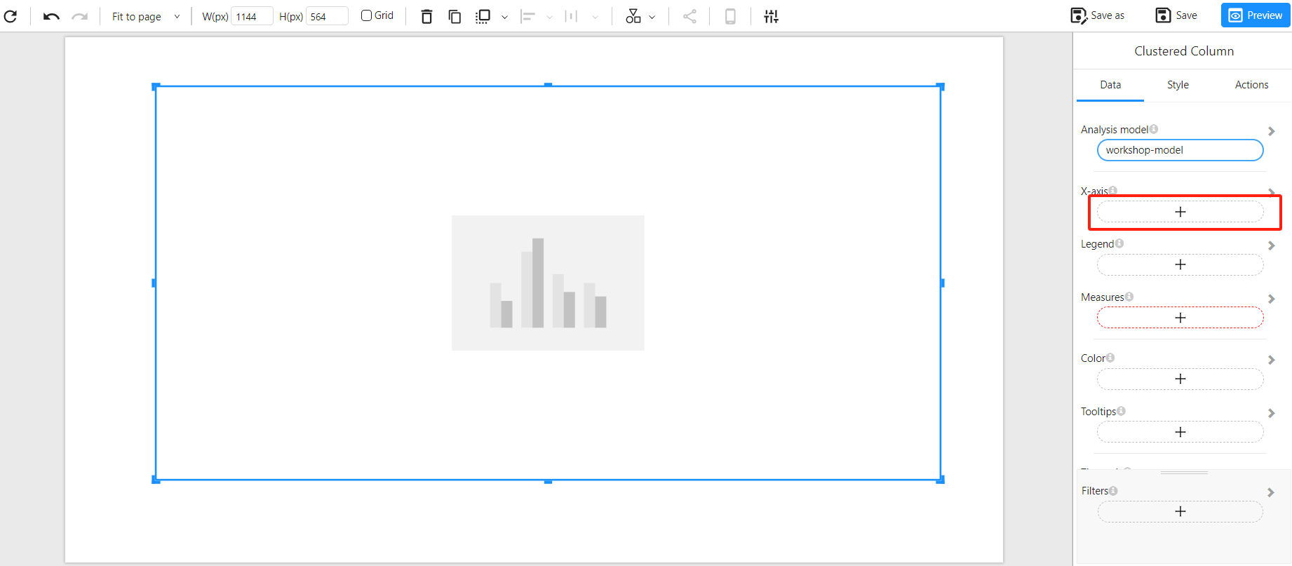
Select the desired field.
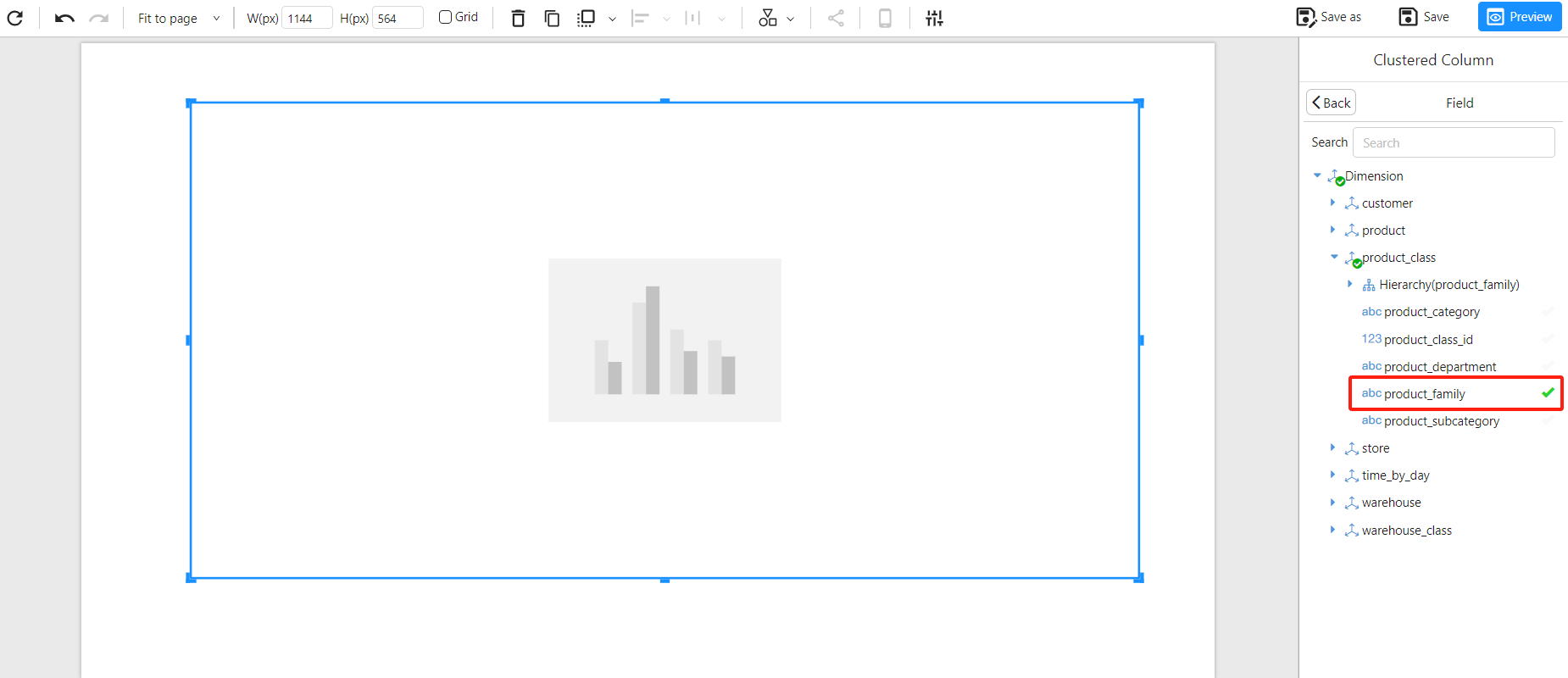
Click "Back" again to return to the data panel.
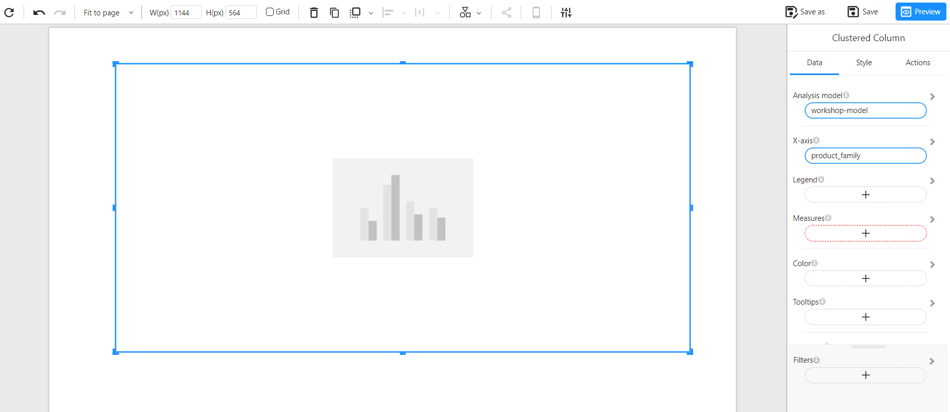
Similarly, add the "Measure" field just like the X-axis field.
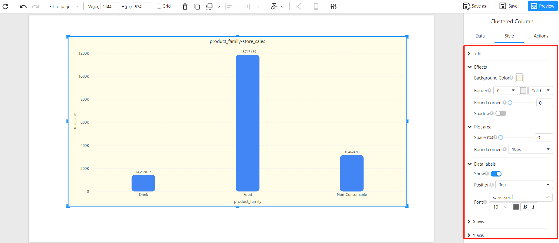
Customize Chart Style and Formatting
Select the chart and click on the "Style" panel on the right to open the styling options.
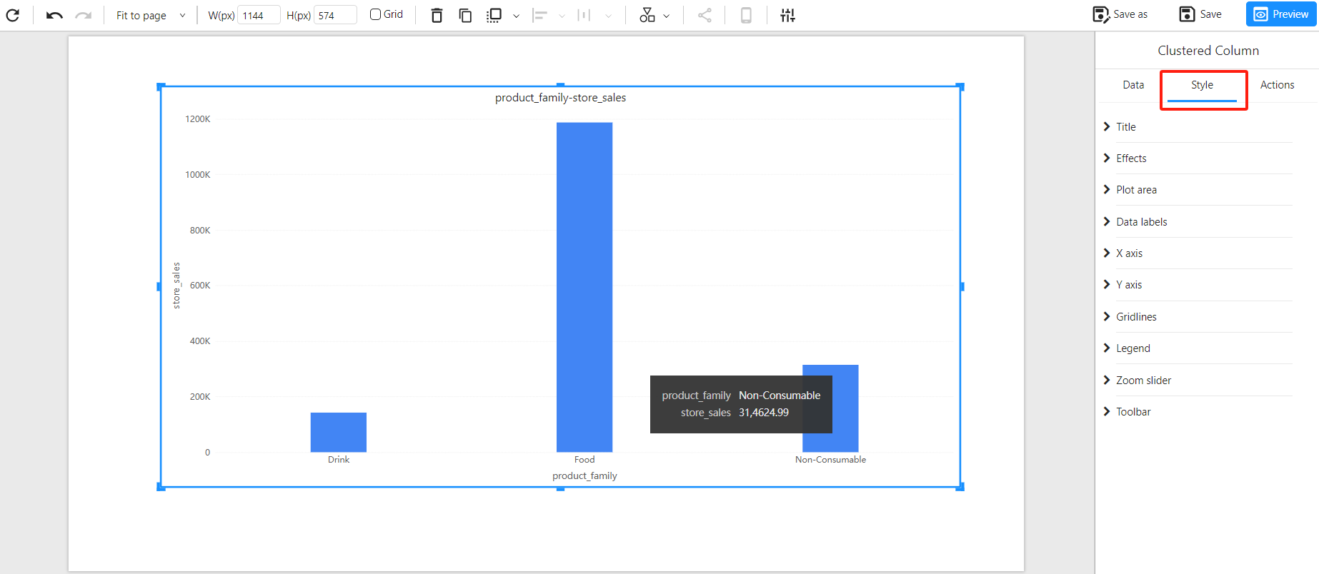
Adjust the following settings as needed:
- Title & Labels: Configure the chart title, font, color, and size. Adjust axis labels' display settings.
- Background & Borders: Modify the background color, border styles, and shadow effects to align with the report's overall theme.
- Data Labels: Enable and format data labels to improve readability and provide better insights.
Adjust Chart Layout
Resize and reposition the chart on the report canvas by dragging its borders to ensure optimal visibility.
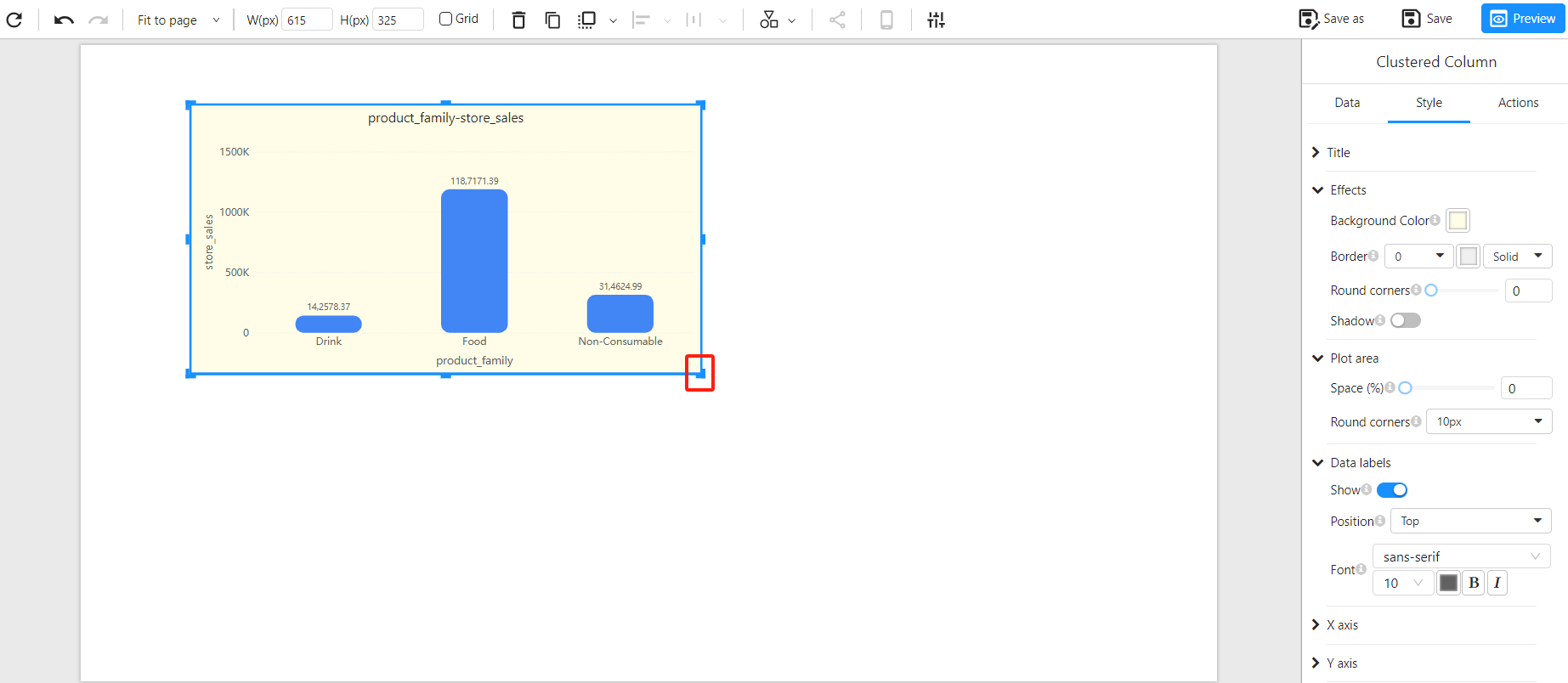
Use alignment tools, gridlines, and distribution options to ensure that multiple charts are properly aligned, enhancing the report's readability and visual appeal.