Appearance
Combo
Overview
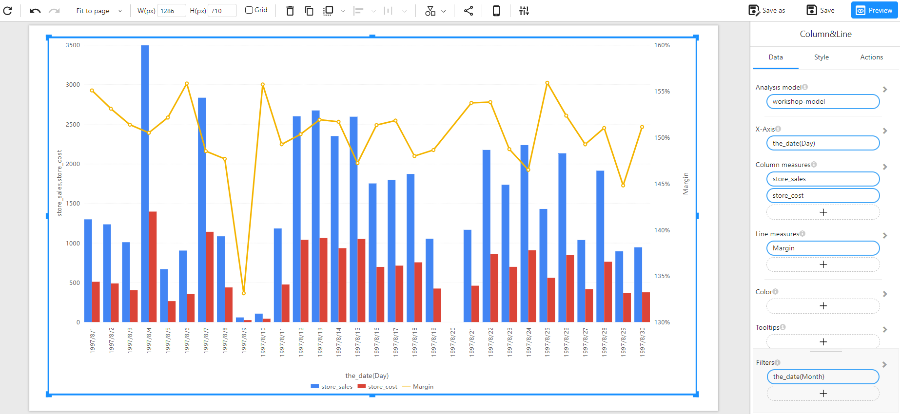
A Combo Chart is a combination of a bar chart and a line chart. It is useful for comparing multiple measures, where some are represented as columns and others as lines.
When to Use
- To compare two different measures with different scales (e.g., store sales vs. margin percentage).
- To analyze trends and distributions in the same visualization.
- To highlight relationships between two numerical variables.
Data Structure
A Combo Chart requires:
- X-Axis: A time-based or categorical field (e.g.,
the_date(Day)). - Column Measures: One or more numerical fields representing the bar values (e.g.,
store_sales,store_invoice). - Line Measures: One or more numerical fields representing the trend lines (e.g.,
Margin,store_cost). - Color(Optional): Assign different colors for better distinction.
- Tooltips(Optional): Show additional details when hovering over data points.
- Filters (Optional): Used to refine the displayed data (e.g., filtering by month, category, or region).
Example Data Structure
| the_date(Day) | store_sales | store_invoice | Margin |
|---|---|---|---|
| 1997-08-01 | 1200 | 900 | 155% |
| 1997-08-02 | 1100 | 870 | 150% |
| 1997-08-03 | 1000 | 850 | 145% |
| 1997-08-04 | 950 | 820 | 140% |
| 1997-08-05 | 1300 | 1000 | 160% |
| 1997-08-06 | 500 | 400 | 135% |
Example
The following example visualizes store sales, store_cost as columns and margin as a line over a period of time.