Appearance
Pie
Overview
A Pie Chart is used to represent proportions of a whole, displaying data as slices of a circle. Each slice corresponds to a category and its relative contribution to the total. This type of visualization is ideal for understanding distribution and comparison at a glance.
When to Use
- To show proportions of a dataset where categories contribute to a whole.
- To compare relative sizes of groups without focusing on trends over time.
- To simplify categorical data into an easily interpretable format.
Data Structure
A Pie Chart requires:
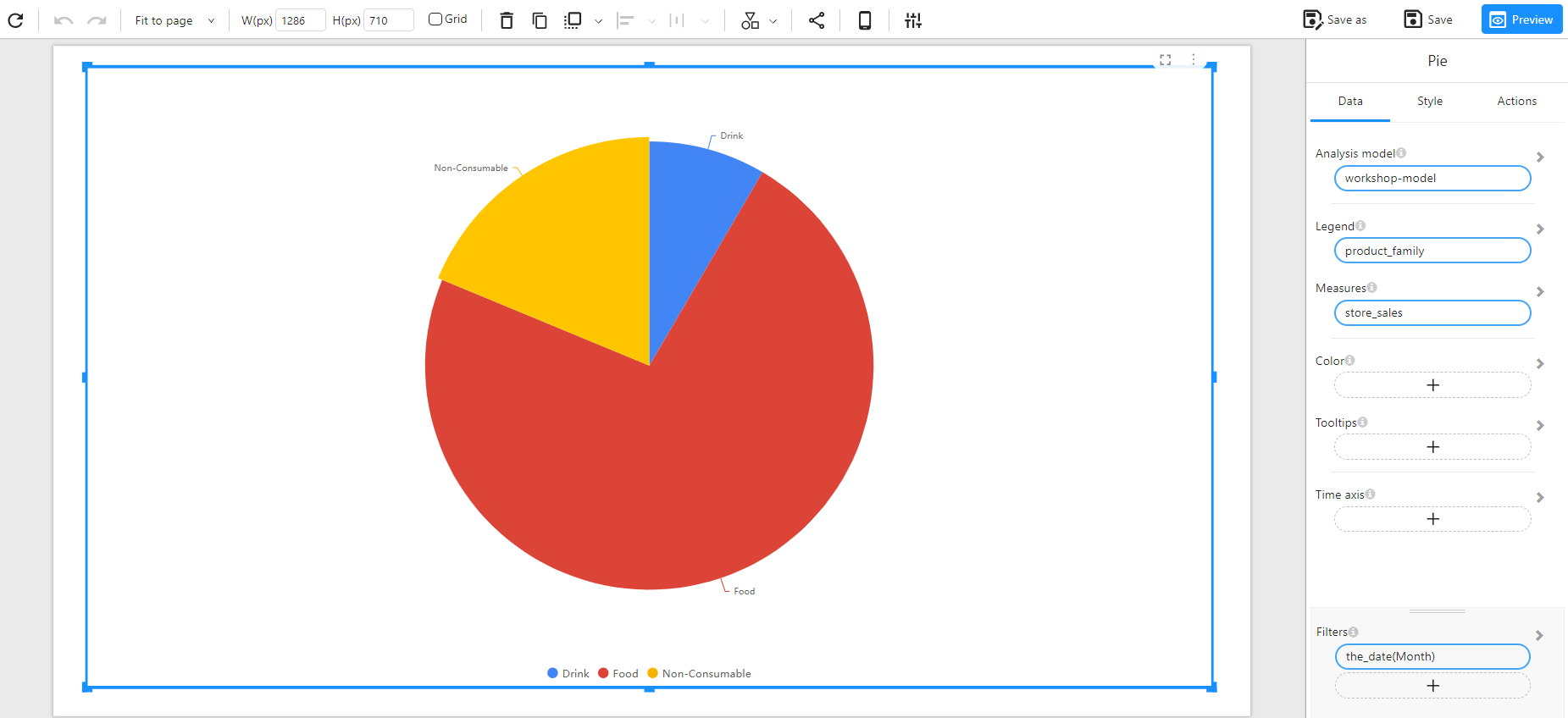
- Legend: A categorical field that defines different slices (e.g., Product Family, Department, Category).
- Measures: A numerical field representing the values that define the size of each slice (e.g., Sales, Revenue, Units Sold).
- Color(Optional): Used to set the color of the chart based on categories or numerical values (intensity-based coloring, or using a categorical field for distinct colors).
- Tooltips(Optional): Show additional details when hovering over bars.
- Filters (Optional): Used to refine the data displayed by the chart (e.g., filtering by month, region, or product type).
Example Data Structure
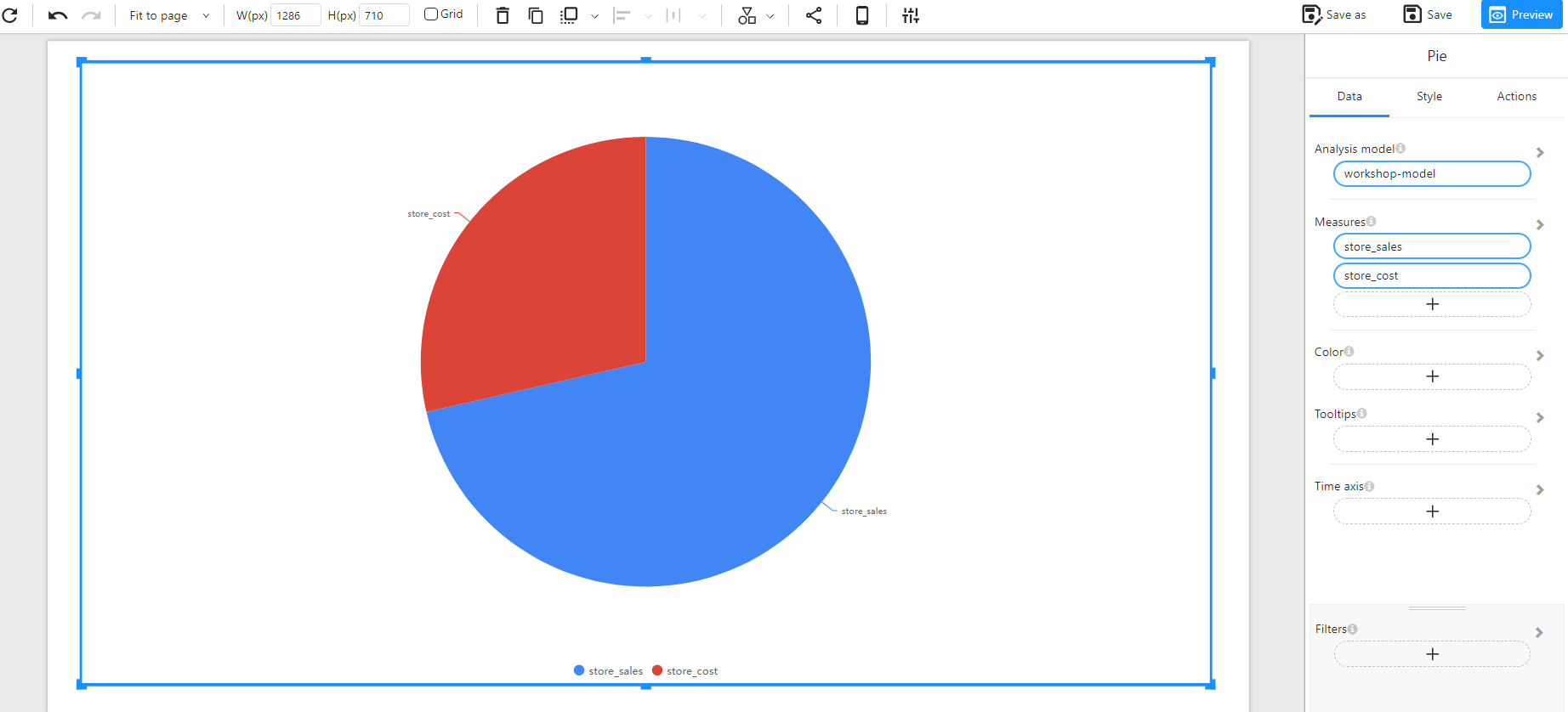
| product_family | store_sales | store_cost |
|---|---|---|
| Drink | 4802.03 | 1925.31 |
| Food | 41484.40 | 16562.05 |
| Non-Consumable | 10679.21 | 4258.77 |
Comparing a Single Measure
Comparing Multiple Measures