Appearance
Scatter Plot
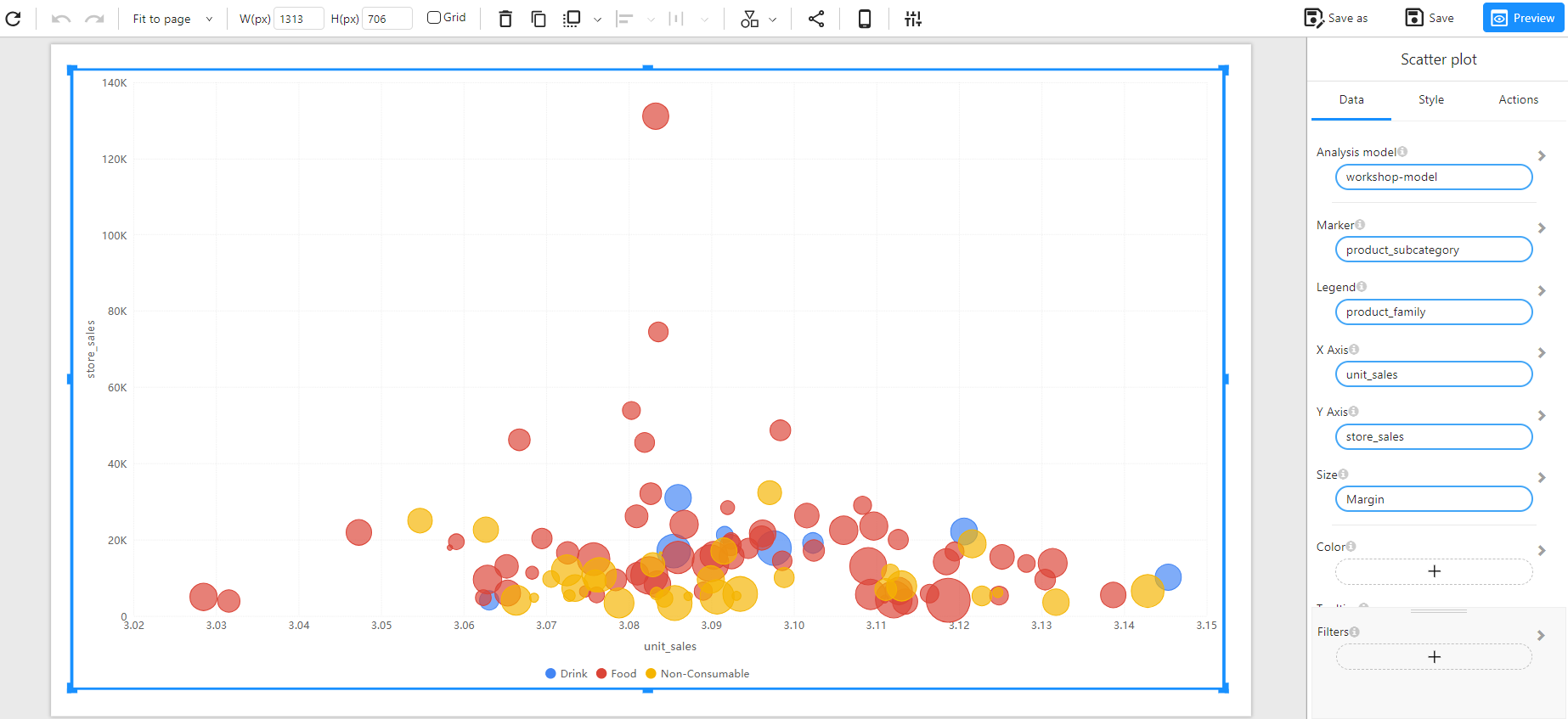
Overview
A Scatter Plot is a visualization technique that represents relationships between two numerical variables. Each point on the chart corresponds to an observation, helping to identify patterns, trends, and correlations between the variables.
When to Use
- To analyze relationships between two numerical variables.
- To detect clusters, trends, and outliers in data.
- To visualize correlations between different measures (e.g., unit sales vs. store sales).
- To represent multiple categories with colors and different marker sizes.
Data Structure
A Scatter Plot requires:
- X-Axis: A numerical field (e.g.,
unit_sales). - Y-Axis: A numerical field (e.g.,
store_sales). - Marker: A categorical field representing distinct groups (e.g.,
product_subcategory). - Legend: A categorical field to differentiate data points by color (e.g.,
product_family). - Size (Optional): A numerical field to adjust the marker size based on values (e.g.,
Margin). - Color(Optional):Customize colors to represent different groups.
- Filters (Optional): Used to refine the displayed data (e.g., by date, product type, or region).
Example Data Structure
| product_subcategory | product_family | unit_sales | store_sales | Margin |
|---|---|---|---|---|
| Fresh Vegetables | Food | 3.05 | 12000 | 200 |
| Frozen Chicken | Food | 3.12 | 35000 | 500 |
| Chocolate Candy | Non-Consumable | 3.08 | 15000 | 300 |
| Soft Drinks | Drink | 3.10 | 18000 | 250 |
| Potato Chips | Non-Consumable | 3.06 | 9000 | 150 |
Example
The following example visualizes the relationship between unit sales and store sales across different product subcategories, with marker size representing the Margin.