
Appearance
Text
Overview
The Text Component is used to display textual content within a page or report. It allows users to format, style, and align text according to their needs, making it an essential element for labeling, providing descriptions, or adding contextual information.
Use Cases
- Adding Titles and Labels: Use text elements to create section headers and labels.
- Providing Explanatory Content: Include descriptions or additional details to complement visual elements.
- Customizing Text Appearance: Adjust fonts, colors, and alignment for better readability and aesthetics.
Configuration Parameters
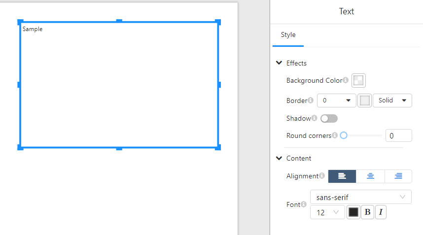
1. Effects
| Parameter | Description |
|---|---|
| Background Color | Sets the background color of the text box. |
| Border | Defines the border width and style (Solid, Dashed, Dotted). |
| Shadow | Enables or disables a shadow effect around the text box. |
| Round Corners | Adjusts the corner radius for a softer appearance. |
2. Content Formatting
| Parameter | Description |
|---|---|
| Alignment | Aligns text to the left, center, or right. |
| Font | Specifies the font family (e.g., sans-serif). |
| Font Size | Adjusts the text size. |
| Font Color | Sets the color of the text. |
| Bold (B) | Toggles bold formatting. |
| Italic (I) | Toggles italic formatting. |
Usage Guide
1. Adding a Text Component
- Select the Text Component from the panel and drag it to the desired location on the page.
2. Formatting Text
- Modify the font, size, and color using the Content section in the Style Panel.
- Align the text using the left, center, or right alignment options.
- Apply bold or italic styles as needed.
3. Adjusting Background and Borders
- Set a background color for the text box.
- Adjust the border width and select a style (
Solid,Dashed, orDotted). - Enable shadow effects or round the corners for a softer look.