Appearance
Treemap
Overview
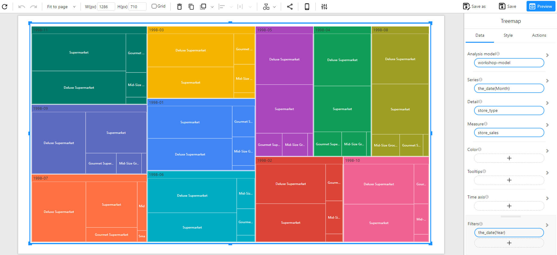
A Treemap Chart is used to visualize hierarchical data as a set of nested rectangles. Each branch of the hierarchy is represented by a rectangle, and its size corresponds to a specific measure. This type of chart is useful for analyzing proportions and identifying dominant categories within a dataset.
When to Use
- To visualize hierarchical data in a compact and space-efficient way.
- To compare proportions between different categories and subcategories.
- To identify patterns such as the largest or smallest contributors within a dataset.
Data Structure
A Treemap Chart requires:
- Series: A categorical field representing the top-level grouping (e.g.,
the_date(Month)). - Detail: A categorical field defining subcategories within each group (e.g.,
store_type). - Measure: A numerical field representing the value used to size the rectangles (e.g.,
store_sales). - Color (Optional): Used to set the color of the chart based on categories or numerical values (e.g.,
store_salesfor intensity-based coloring, or a categorical field for distinct colors). - Tooltips (Optional): Additional information to be displayed when hovering over the sections.
- Time Axis (Optional): Allows for time-based filtering.
- Filters (Optional): Used to refine the displayed data (e.g., filtering by year or region).
Example
Data Structure
| the_date (Month) | store_type | store_sales |
|---|---|---|
| 1998-11 | Supermarket | 73920.69 |
| 1998-11 | Deluxe Supermarket | 62067.19 |
| 1998-11 | Gourmet Supermarket | 14364.67 |
| 1998-11 | Mid-Size Grocery | 10940.17 |
| 1998-11 | Small Grocery | 5458.03 |
| 1998-09 | Supermarket | 78567.44 |
| 1998-09 | Deluxe Supermarket | 65789.32 |
| 1998-09 | Gourmet Supermarket | 16789.53 |
Treemap Chart