Appearance
Waterfall
Overview
A Waterfall Chart is used to visualize how an initial value is affected by a series of intermediate positive or negative changes. It helps in understanding the cumulative effect of sequential changes in a value over time or across categories.
This chart is particularly useful in financial analysis, operational performance, and variance analysis to explain how a value evolves step-by-step.
When to Use
- To analyze incremental changes contributing to a total.
- To display positive and negative contributions to a metric.
- To explain variance between starting and ending values.
- To visualize cumulative growth over time or across groups.
Data Structure
A Waterfall Chart requires the following fields:
- Analysis model: The data source containing relevant fields.
- Field: A categorical or time-based dimension (e.g., Month, Department).
- Measure: A numeric field representing the change values (e.g., Profit delta, Monthly growth).
- Time axis (Optional): A time-based field to sort the data chronologically.
- Filters (Optional): Used to narrow down the scope of data shown in the chart.
Example Data
| month | change_value |
|---|---|
| Jan | 500 |
| Feb | 200 |
| Mar | -300 |
| Apr | 100 |
| May | -200 |
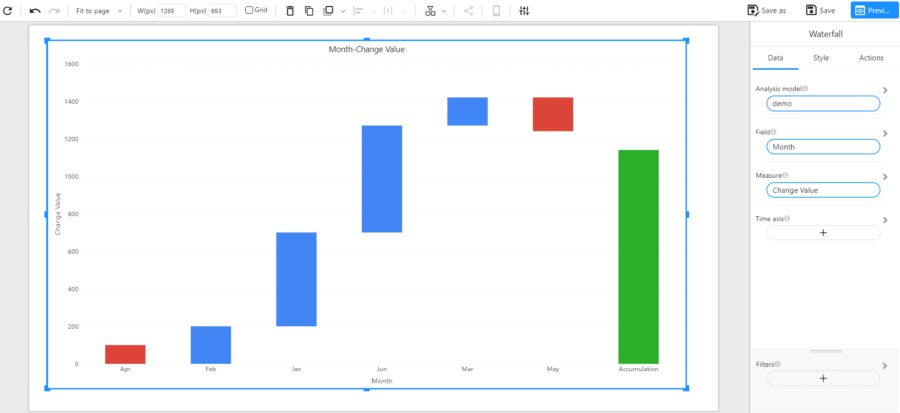
Example
The example below shows monthly changes and the resulting total. Each bar represents the increase or decrease in value, with the final green bar showing the cumulative result: